Graphic manual for Önska
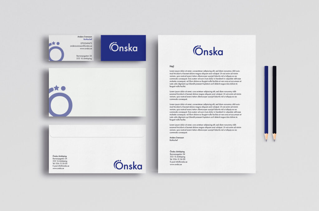
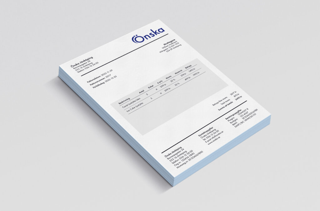
This case was basically to create a new graphic manual for an existing company. We got to choose the company ourselves but the company couldn’t be too big. I chose the shop Önska which is specialized in making kitchen gadgets, furnishings and trinkets. We were supposed to make a new logo, develop new colors and fonts as well as making several mockups. It wasn’t a sharp assignment in my case but I had some contact with the company during the process to see if they had any existing material to look at. The pictures down below are just a small extract from the graphic manual so if you want to take a look at the complete manual you can download the pdf down below.
Volvo perfume
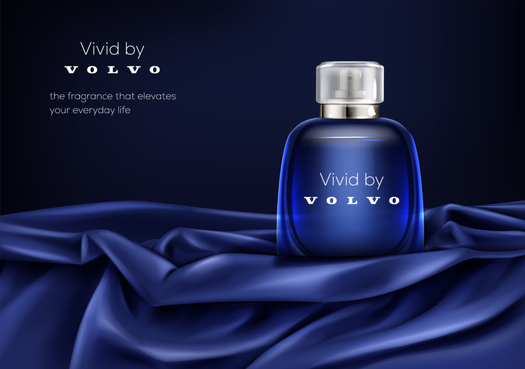
This case was to think about how it could look if Volvo were to launch a perfume. We were supposed to work more with the concept than delivering a finished product. So I will try to explain my thoughts and then I will show you my concept design.
When we got this assignment we were given five questions that we were supposed to answer. The questions were: What is the name of the perfume? What does it convey? Who is it for? How does it look? What’s the purpose? I chose the name Vivid by Volvo. I associate Volvo with a vivid lifestyle and I also think it sounds good together. I want the perfume to convey vivacity, stability, endurance and everyday luxury. The perfume is meant to be timeless, a safe choice for the everyday use. It’s a unisex perfume and it’s meant for everyone who wants it. The scent would be based of citrus tones, which gives a fresh and vivid aroma.
I would say that the purpose of launching a perfume for Volvo is to strengthen their primary brand and to reach more people. I think that they would want to sell cars with the perfume and not perfumes with the cars. I also think that launching a perfume is a great opportunity to convey their brand more clearly, to convey what they want to be associated with. It would be a chance for Volvo to reduce opinions that they don’t want to have about themselves, such as being too boring or too normal. These thoughts resulted in this concept that I came up with. Vivid by Volvo – the fragrance that elevates your everyday life.
Redesigning a book cover
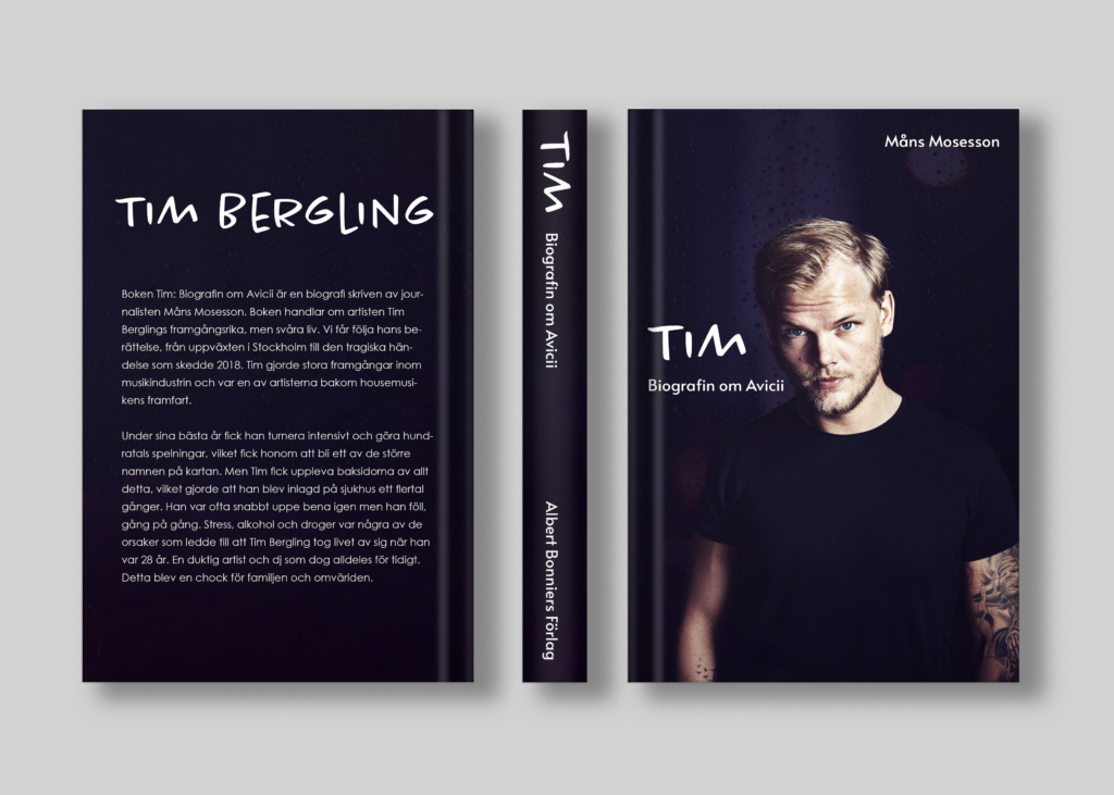
This case was to redesign an existing book cover. We had the assignment to read a book in our copywriting class and then we got to redesign the cover of the book. I read the book “Tim – Biografin om Avicii” which is a biography about the DJ and artist Avicii. I used Photoshop to do this assignment and I worked with several layers of pictures to get the background I wanted.
Printed matter for a festival
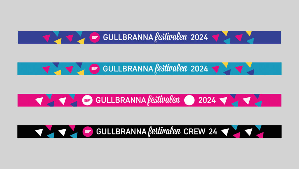
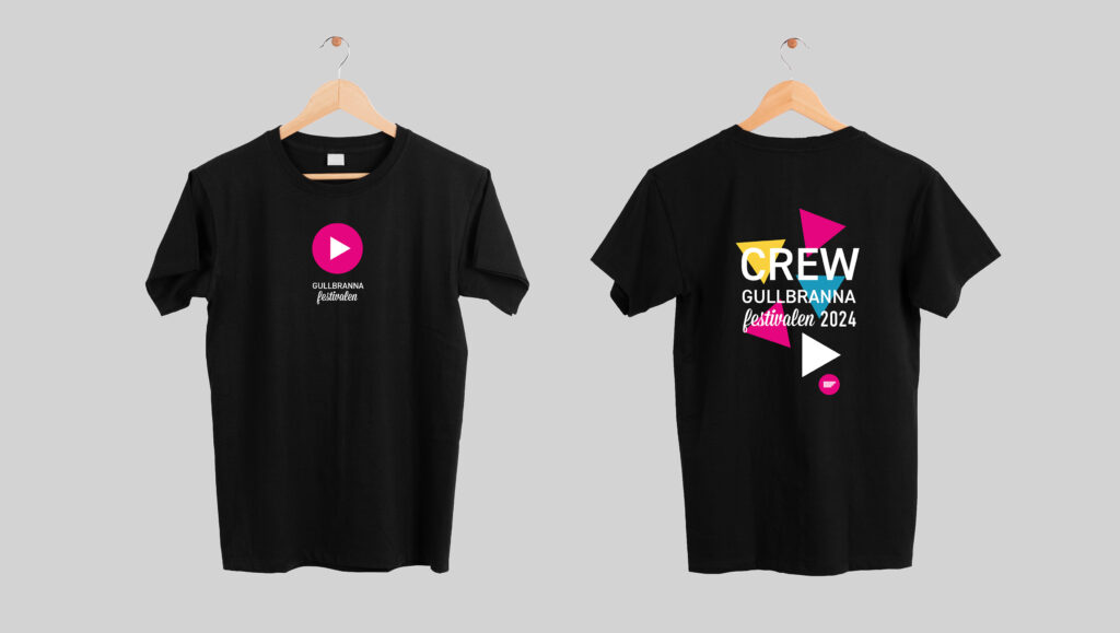
In my internship I got the chance to design some of the printed matter for the festival Gullbrannafestivalen. I was free to work with different colours and shapes. I also made an animation which was used on the led screens on stage. This assignment was very fun and it was very nice seeing it coming to use and people liking it.
Redesigning a website
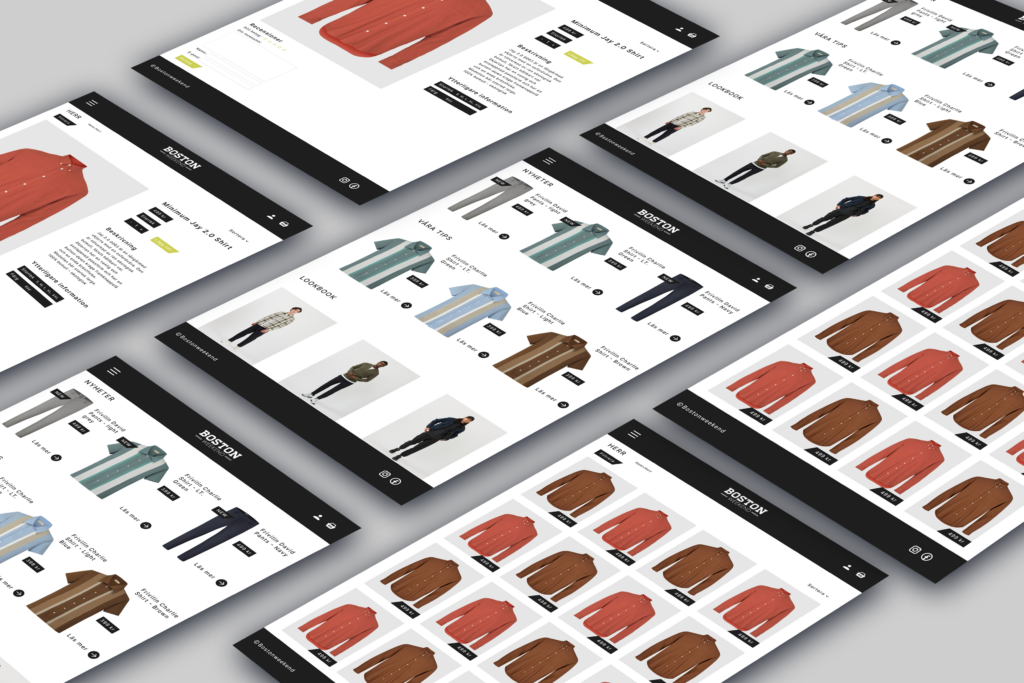
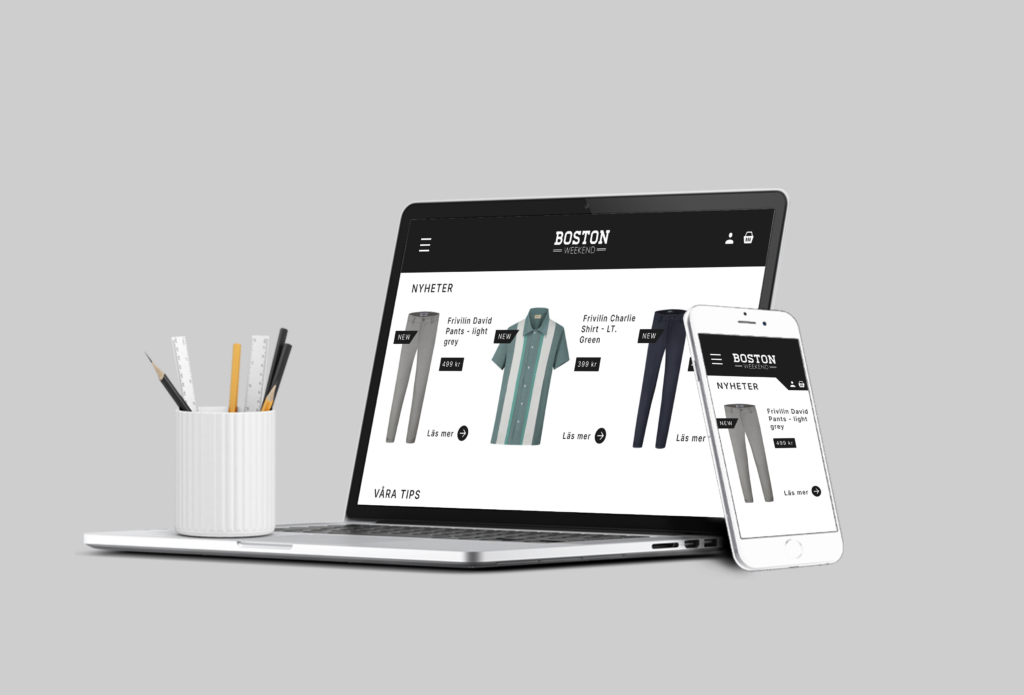
This case was to redesign a website of free choice. The only requirement was to choose a website that we could see improvements in. I chose a local clothing company from my hometown which is called Boston Weekend. It’s a clothing company working mainly with men’s wear. They have not had a website for too long and that’s mainly because it’s a small town and they work more locally. But about two years ago they made the step and launched a website too. From the start I thought that the original site was a little bit busy and too much. So my goal was to make it more clean and modern.
It was not a sharp assignment so they are not using the design now. I know the owners so I told them that I were doing this and they were interested in seeing what I had done, but then the shop unfortunately closed down so it never happened. But it was a fun assignment and I learned a lot in the meantime.
Making a logo for a sustainability project
This case was a logo assignment for a couple of friends that are doing service in Congo right now. They are working on a project that will motivate children and young people to be more aware about the environment. The project is called La jeunesse qui change. They asked me if I could make a logo for the project. The criteria was to involve children in the logo and to reflect sustainability thinking in some way.
To explain my thoughts behind this logo I wanted the children to be in focus. I also wanted to achieve the feeling of community and togetherness, which is conveyed with the children holding hands. The environment and sustainability thinking is reflected in the circular shape and the green color shade. I made an alternative version for the logo as well, if the text gets to small in the original version.
Logo assignment
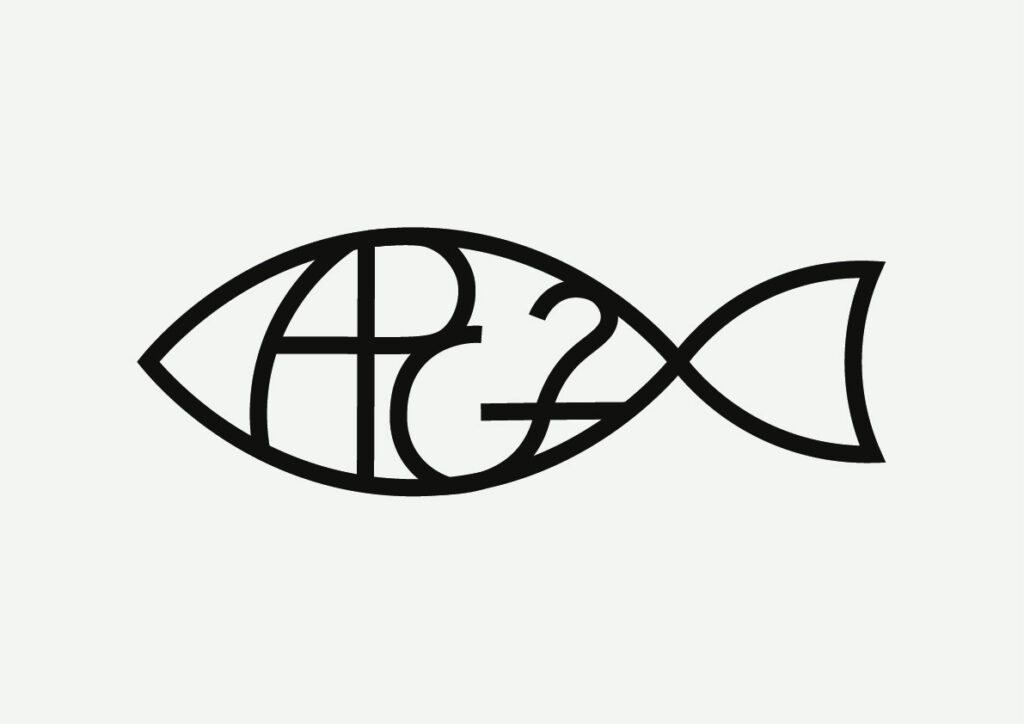
This case was a logo assignment for one of my friends. He asked me if I was able to make a logo for his christian mission group in his city and I said yes, why not. The criteria was to have APG2 in the logo in some way and he also wanted the logo to picture a fish. I started with the fish and tried to get the text to work with the shape, which took some time but after several versions I came up with this one which I and he was satisfied with.
